A. Maps
1. Introduction
a. What is a map?
A map is a graphic representation of object sizes and locations. Because its coverage and detail are limited, a map is an abstraction of reality with some compromises made on how and what information is shown. A map is a graphic communication medium and should be self-explanatory.
A map is created with a particular emphasis or theme. Figure A-1 is a mid-18th century map of the Northwest Territory.
|
|
|
Figure A-1
Northwest Territory
|
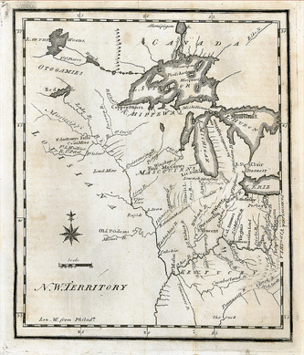
The most distinctive map features in Figure A-1 are major waterways. Because they were important transportation networks and highways of commerce, the map emphasized them in detail The overall visual geography of the territorial area is influenced by the waterway mapping.
b. Maps and Surveyors
Surveyors create maps as well as use them. This topic's scope is basic map composition. Understanding general map principles and characteristics help create more effective maps. Map making is a lot like writing: the more it's done, the better it becomes.
A map can be a traditional paper product or a digital model. The formats may differ but they share some common characteristics. Both:
- are a simplified representation of reality
- depend on data collection to provide sufficient accuracy, and
- require skill and knowledge to faithfully communicate spatial information.
These are important since surveyors generally create maps for other users. A map that can't be understood or doesn't meet a specified need is a waste of time and resources.
c. Disclaimer
This topic is not intended as a definitive map treatise; think of it more as a beginner's guide. Cartography and Geographic Information Sciences offer a wealth of information on map composition, aesthetics, etc, and are a mere internet search away.
2. Classifying
There are may ways to classify or categorize maps. We will use a simple approach based on the kinds of maps surveyors typically use and create. The classifications used here are a matter of convenience and provide a basic framework to understand some basic salient map characteristics.
a. Metric/Non-metric Maps
(1) Metric
A metric map is one on which measurements can be made to support mathematical computations. An critical metric map attribute is scale which allows us to relate map measurements to their real world counterparts. We'll discuss scale in greater detail in a subsequent chapter.
(2) Non-metric
Non-metric maps convey information visually and not necessarily in a fashion that support accurate spatial measurements. Map emphasis is mostly interpretive showing trends, distribution, etc. Their information is often divided into classification groups and use colors, symbol types, and symbol sizes to provide a visual impression of the data.
Figure A-1 is an example of a non-metric map, compiled by National Public Radio (www.npr.org). It is a map of the United States with each state a colored hexagon. Hexagons are all the same size and their color shows Coronavirus case growth over the previous two weeks.
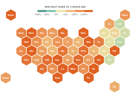 |
| Figure A-1 Coronavirus Case Growth, 20 Nov 2020 |
The map is roughly US-shaped; states are generally in correct relative positions. The map's emphasis is disease spread, not accurate spatial measurements. Everything else being the same, color allows quick data interpretation.
Another example of a non-metric map is one using graduated symbols to show major US cities population. Symbol sizes visually communicate different populations. Figure A-3 shows five different population values (center column) and two different symbol gradations schemes.
- Gradations on the left are proportional based on symbol radius, eg, Radius200K = 2x(Radius100K)
- Gradations in the right column are proportional based on symbol area, eg, Area200K = 2x(Area100K)
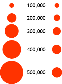 |
| Figure A-3 Symbol Gradation |
Comparing the symbol gradations:
- Radius-based sizes appear to increase at a rate greater than population increase causing over-estimation at higher populations.
- Area-based sizes appear to increase at a lower rate than population change. Upper increases are not discernible (compare 400,000 and 500,000). Cumulative effect is under-estimation at higher populations.
Neither geometric gradation looks "right". Cartographers use psychological scaling schemes which take into account how our minds perceive size gradations. Psychological scaling is also influenced by color and symbol type. A non-metric map with poor graphic choices can confuse instead of clarify.
(3) Quasi-metric
Quasi-metric maps share characteristics of metric and non-metric maps. Measurements can be made on a quasi-metric map, but there is an inherent uncertainty in feature depictions on the map. The feature location uncertainty is greater than the map compilation accuracy (which we'll look at in a bit).
An example of a quasi-metric map in surveying and engineering is a soil survey map, figure A-4.
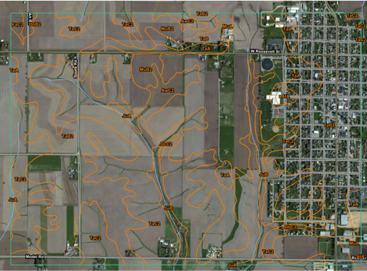 |
| Figure A-4 Soil Survey Map |
Although shown with lines, soil boundaries are not discrete; they are transitional areas between predominant soil types. In mapping parlance, these are called "fuzzy" boundaries. We can measure the area of a soil type polygon, but its certainty will be affected by the boundary fuzziness.
Other common examples of quasi-metric feature depiction include wetlands, ground cover, and forest canopy. Some fuzzy boundaries are transitional by nature, others can change over time.
b. Map Types
For purposes of this topic, we will define three map types based on primary purpose or feature information:
- Planimetric
- Topographic
- Legal
Theses are pretty broad and most maps contain characteristics of multiple types.
(1) Planimetric
The primary emphasis of a planimetric map is horizontal locations of features. The features themselves may be exaggerated for visibility but their locations with respect to other features are correctly depicted.
A road map, Figure A-5, is a good example. At a glance, the user can tell which roads connect municipalities and determine preliminary travel routes. This is a metric map because distances can be determined by measuring along roads.
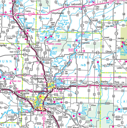 |
| Figure A-5 Road Map |
Figure A-6 is another planimetric map, this one a hand drawn map of major features in relationship to a buried "treasure". It's non-metric: accurate measurements can't be made to locate the treasure. The map depends more on relative spatial interpretation than absolute location to convey its information.
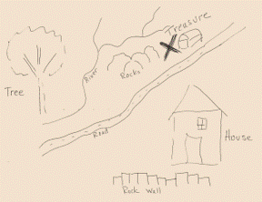 |
| Figure A-6 Treasure Map |
(2) Topographic
A topographic map communicates elevation or surface information. The challenge is to depict earth's third dimension on a traditional two-dimensional map.
One way is to exaggerate terrain characteristics and filter out distracting data. Figure A-7 uses color intensity and shade to emphasize slopes. The user sees the surface variation across the state and how major waterways relate to the terrain. Distractions such as roads, cities, etc, are not included in order to emphasize terrain.
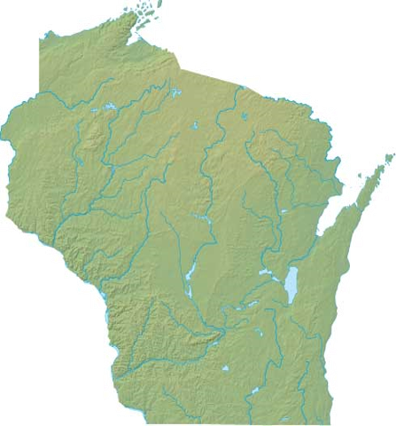 |
| Figure A-7 Shaded Terrain Map |
While an effective way to convey topography, particularly with use of color, the map is non-metric. It is not possible to determine elevation dependent quantities from the map: volumes, slopes, etc. We have a visual impression, but no quantifiable representation.
Another way to depict topography is using contour lines, Figure A-8. A contour is a line of constant elevation which appears only on the map, not on the ground (you can't trip over a contour line).
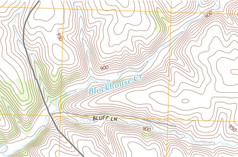 |
| Figure A-8 Contour Map |
A contour map is a metric map. The vertical distance between adjacent contour lines is constant (contour interval). We can draw a line on the map and determine its slope based on the number of contour lines crossed along its length. Volumes can be determined using the areas enclosed by contours. Contour lines are a common way to show surface configuration.
We will discuss contour lines in a a later chapter including characteristics, compilation, and data collection.
(3) Legal
A legal map is a special kind of planimetric map with an emphasis on parcel boundaries. Legal ownership claims and rights change when a parcel boundary is crossed. Like contours, a boundary is often not a physical line on the ground. Unlike most contour maps, however, a legal map affects property ownership.
A legal map either creates new boundaries or shows results of re-establishing old boundaries from records and physical evidence. Because property rights are involved, all states require a surveyor be licensed to create or re-establish property lines.
Figure A-9 is a Certified Survey Map (CSM), a type of legal map in Wisconsin used to create up to 4 new parcels.
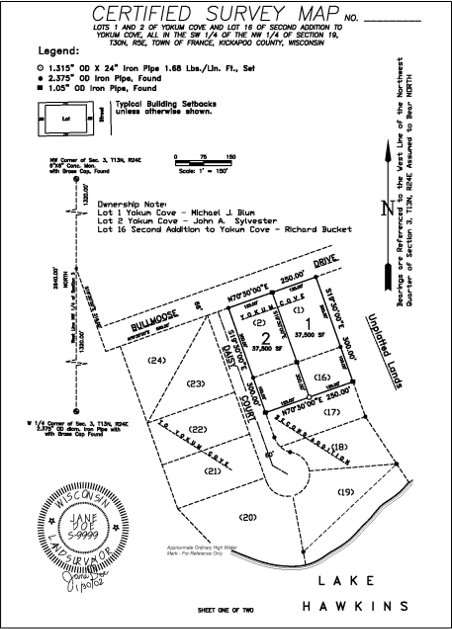 |
| Figure A-9 Certified Survey Map |
The content and format of many legal maps are defined by laws of the respective jurisdiction.
(4) Combinations
Most maps combine various elements of the three types to more effectively convey information.
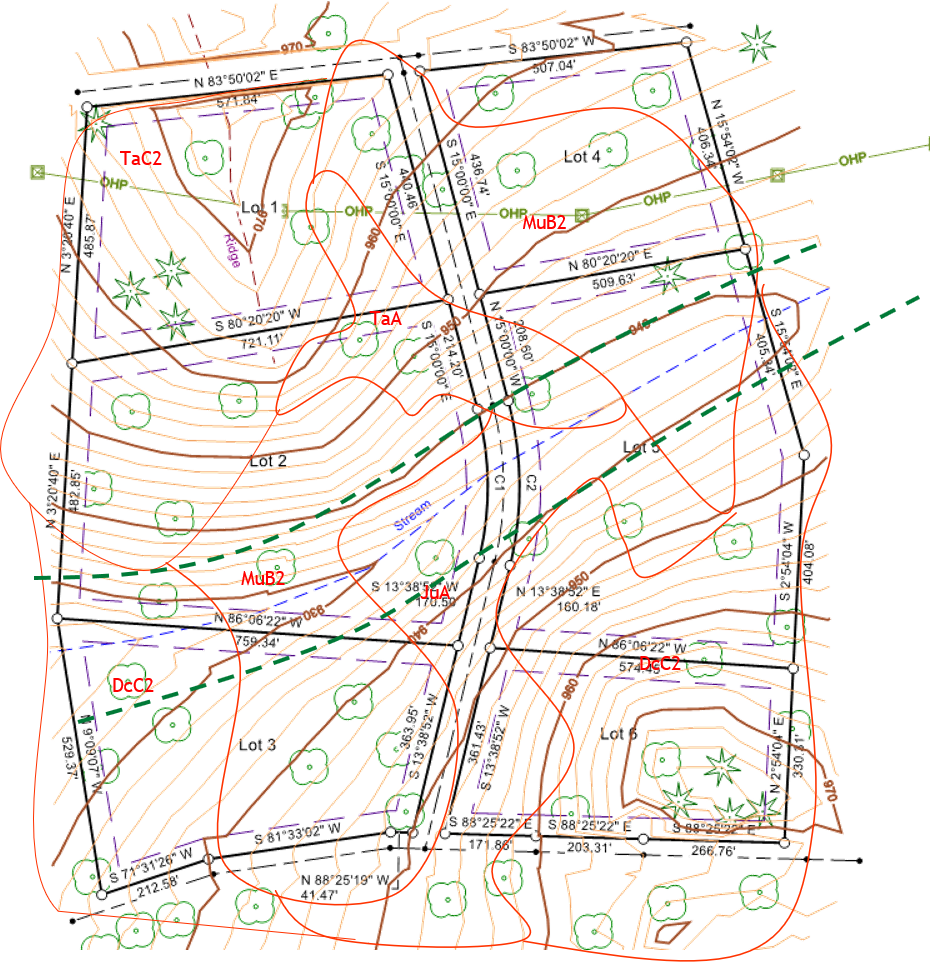
For example. Figure A-10 is a legal map of a proposed subdivision.
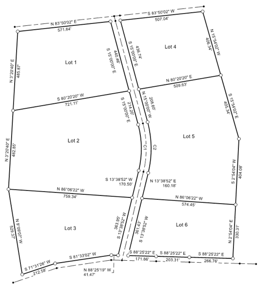 |
| Figure A-10 Subdivision Map |
While it shows property boundaries required by law, it doesn't really provide much information about the rest of the area.
Adding planimetric data, Figure A-11, conveys more information. An overhead power line runs through Lots 1 and 4, a stream through Lots 2, 3, and 5. We can also see where various types of trees are located.
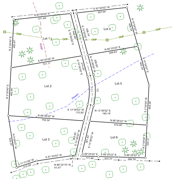 |
| Figure A-11 Subdivision Map with Planimetry |
Finally, including topographic data, Figure A-12, helps identify where slopes may be an issue or site grading might be needed.
|
|
| Figure A-12 Subdivision Map with Planimetry and Contours |
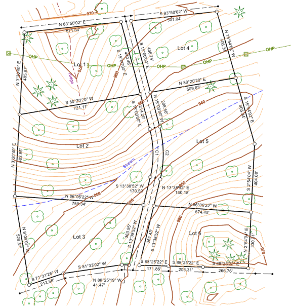
Lots 1 and 6 will probably require material removal to create a level building site; Lot 5 is dominated by a valley with the stream at its center. Because it is a metric map, we can estimate earthwork volumes and design a stream crossing for the new street.
The more information contained on a map, the more decisions it can support.
On the other hand, too much information can make the map hard to interpret or use. In Figure A-13 minimum building setback lines, soil boundaries, and floodplain limits have been added. It starts to become confusing.
 |
| Figure A-13 Too Much Information? |
It can be even worse. Back in the days of manual drafting, drawings were basically black and white, Figure A-14.
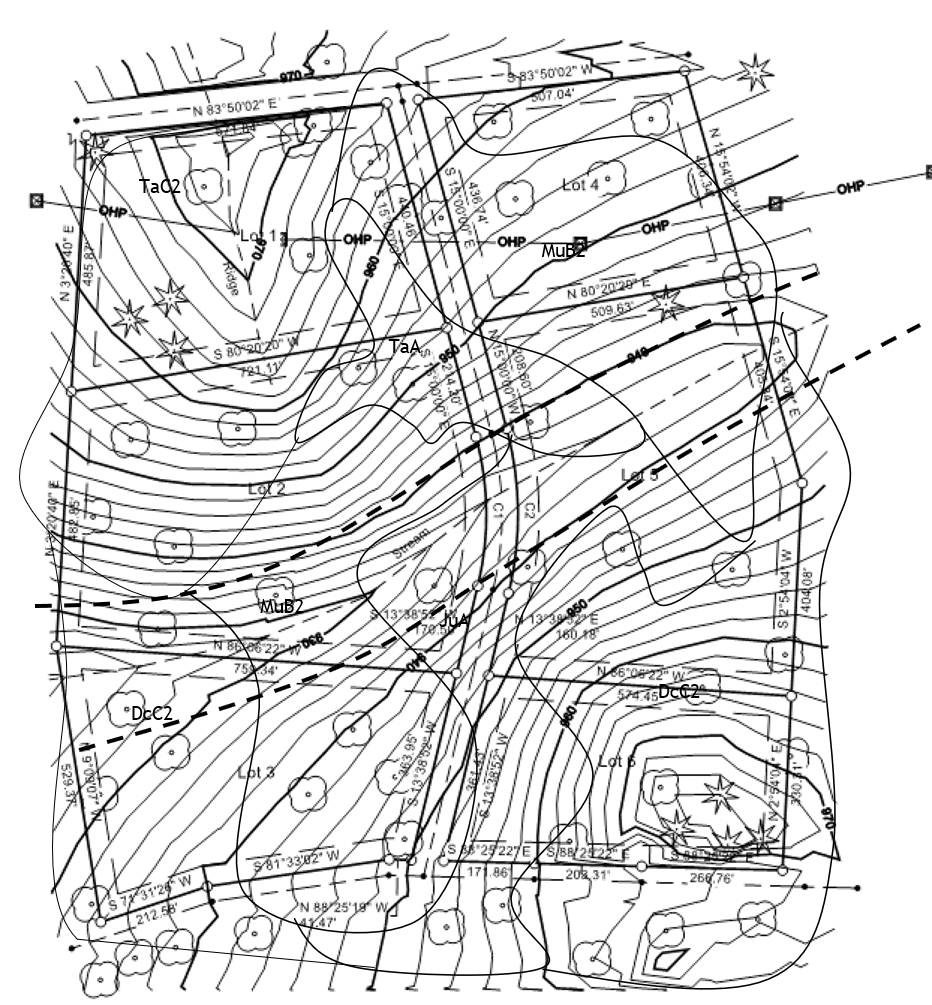 |
| Figure A-14 Map in Black and White |
Without color, the map becomes even harder to interpret. Contemporary digital mapping systems support colors and data management by layer or theme. A map can be produced which only displays that information required for the current need. However, because different quality data can be mixed in digital systems, accuracy is often overestimated.
Interpretation difficulty at best makes a map unsuitable or, at worse, cause costly mistakes. In the next chapter we will discus elements that should be included on a map to facilitate interpretation.